
STRATEGY RESULTS
The Zone Comes First.
The Move Comes After.
Real MT5 charts from our core order-flow strategy. Each example shows the institutional zone marked before price arrived, then what price did after.
11chart examples
8currency pairs + the US Dollar Index
M15–H4timeframes
1
Before
The supply or demand zone is marked in advance, with the entry and the stop defined.
2
After
The same chart later, showing how price reacted when it reached the zone.
3
Reward-to-risk
How far price moved in the trade’s favour, measured in multiples of the risk taken.
Chart Examples
Tap any chart to open it full size.
EURUSDM30 chart
BUY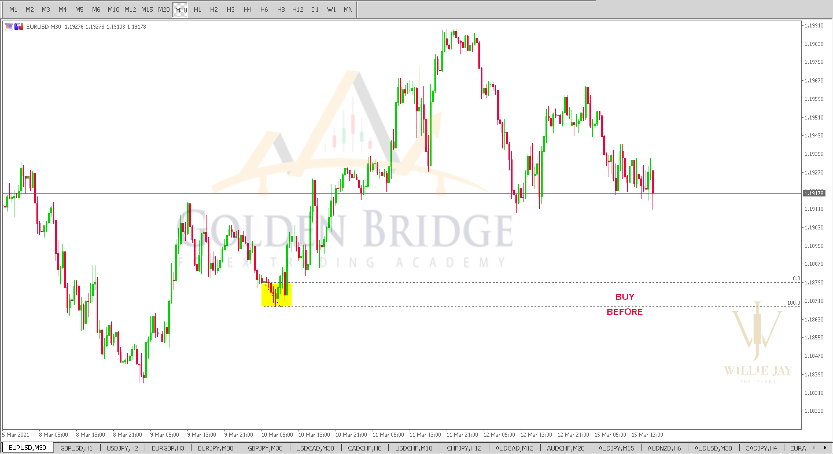
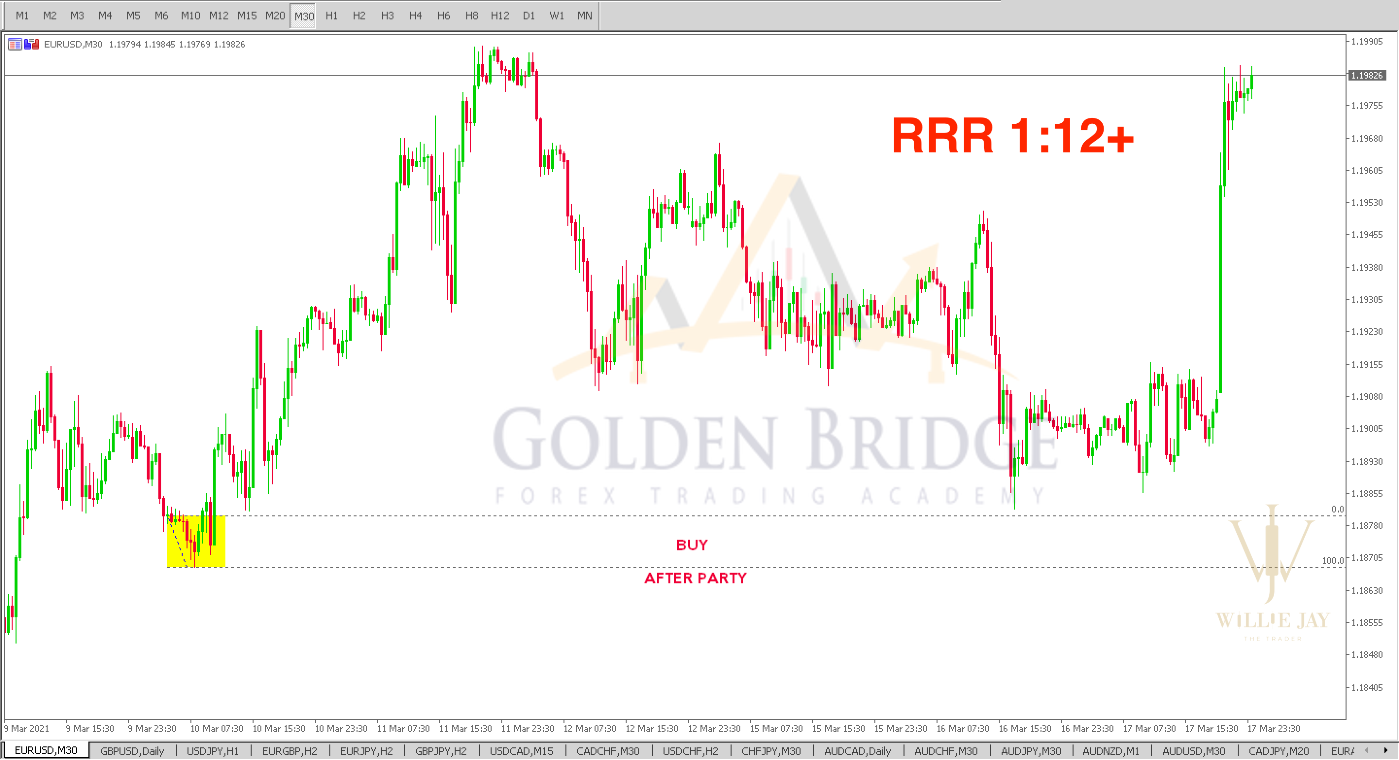
Price moved about 12× the risk (RRR 1:12+)
US Dollar IndexM30 chart
BUY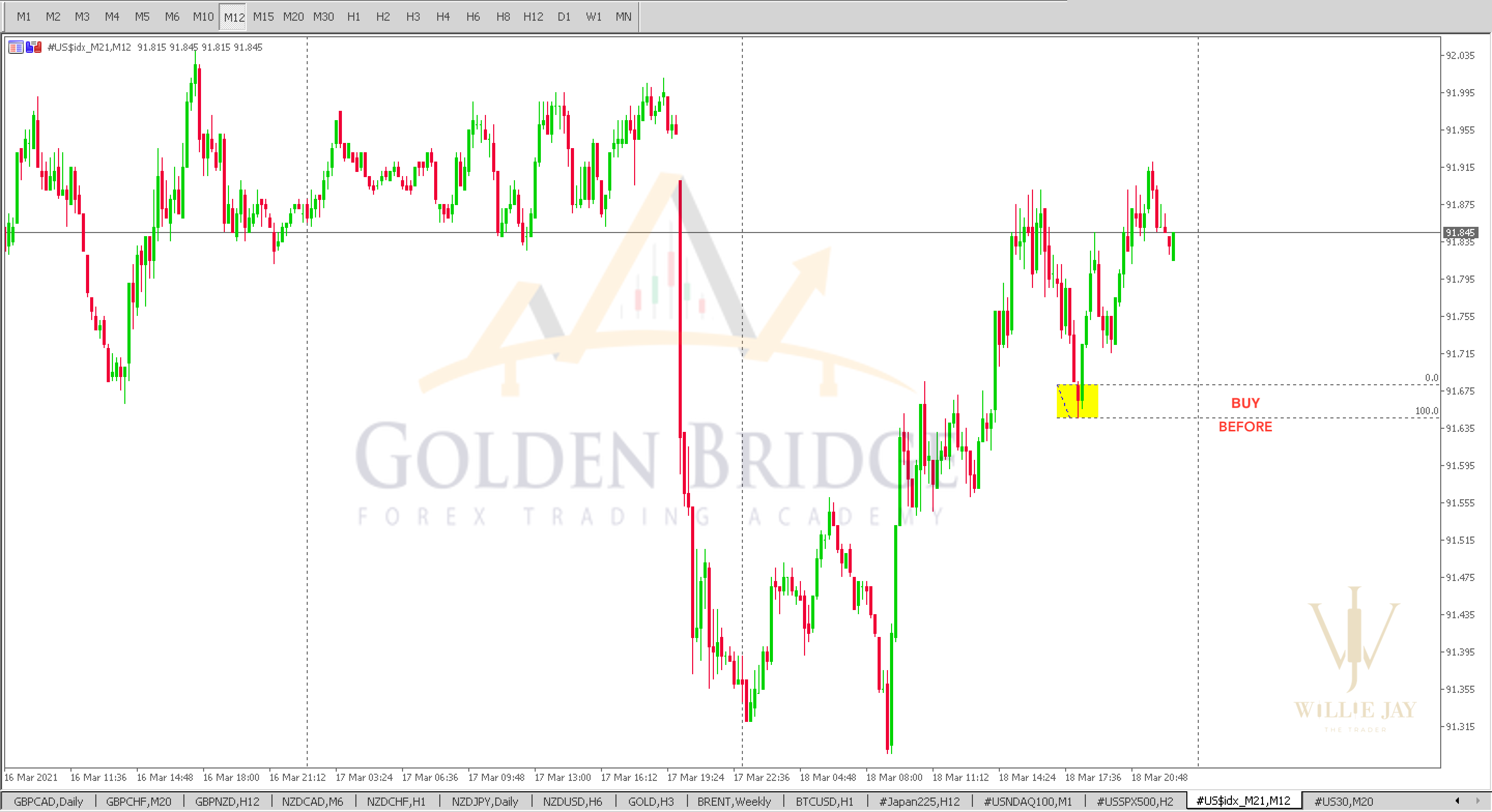
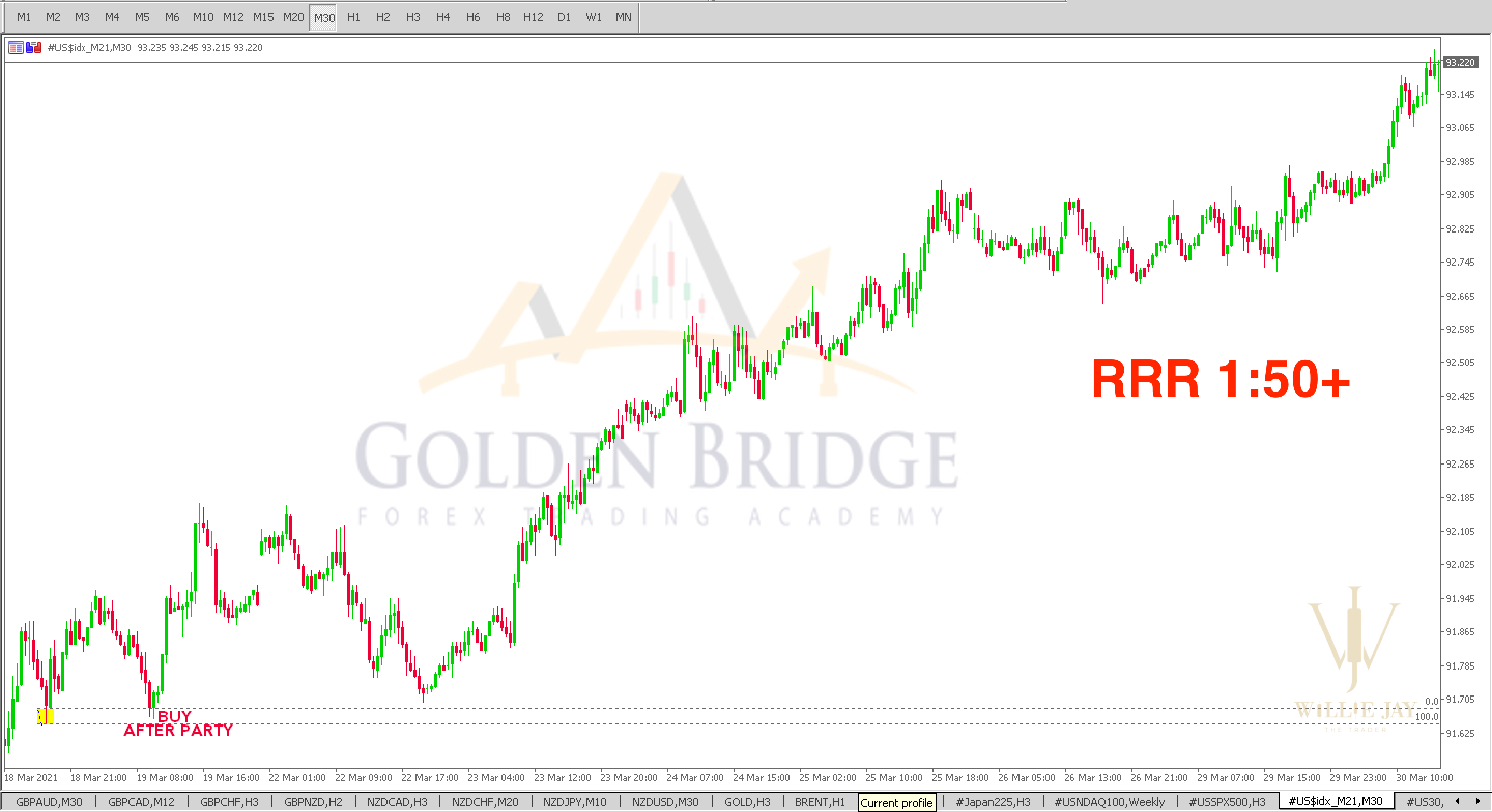
Price moved about 50× the risk (RRR 1:50+)
EURAUDH4 chart
BUY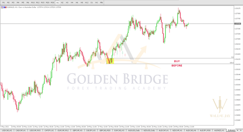
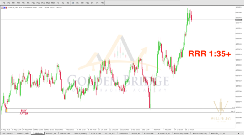
Price moved about 35× the risk (RRR 1:35+)
NZDUSDH3 chart
SELL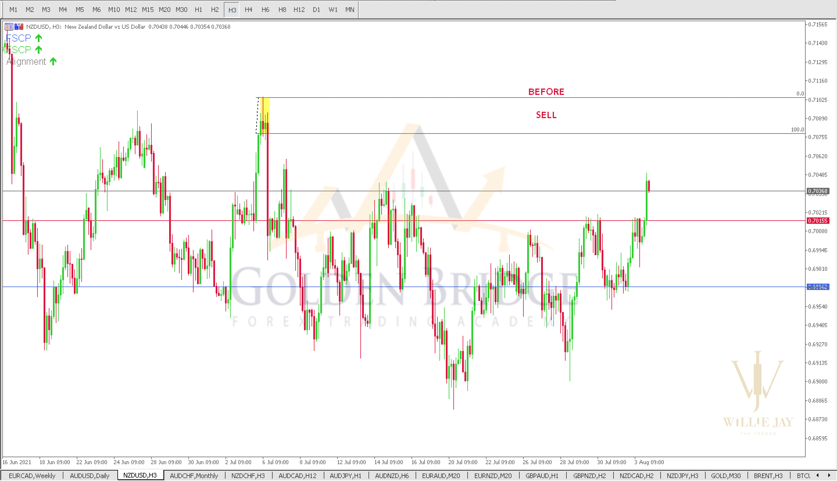
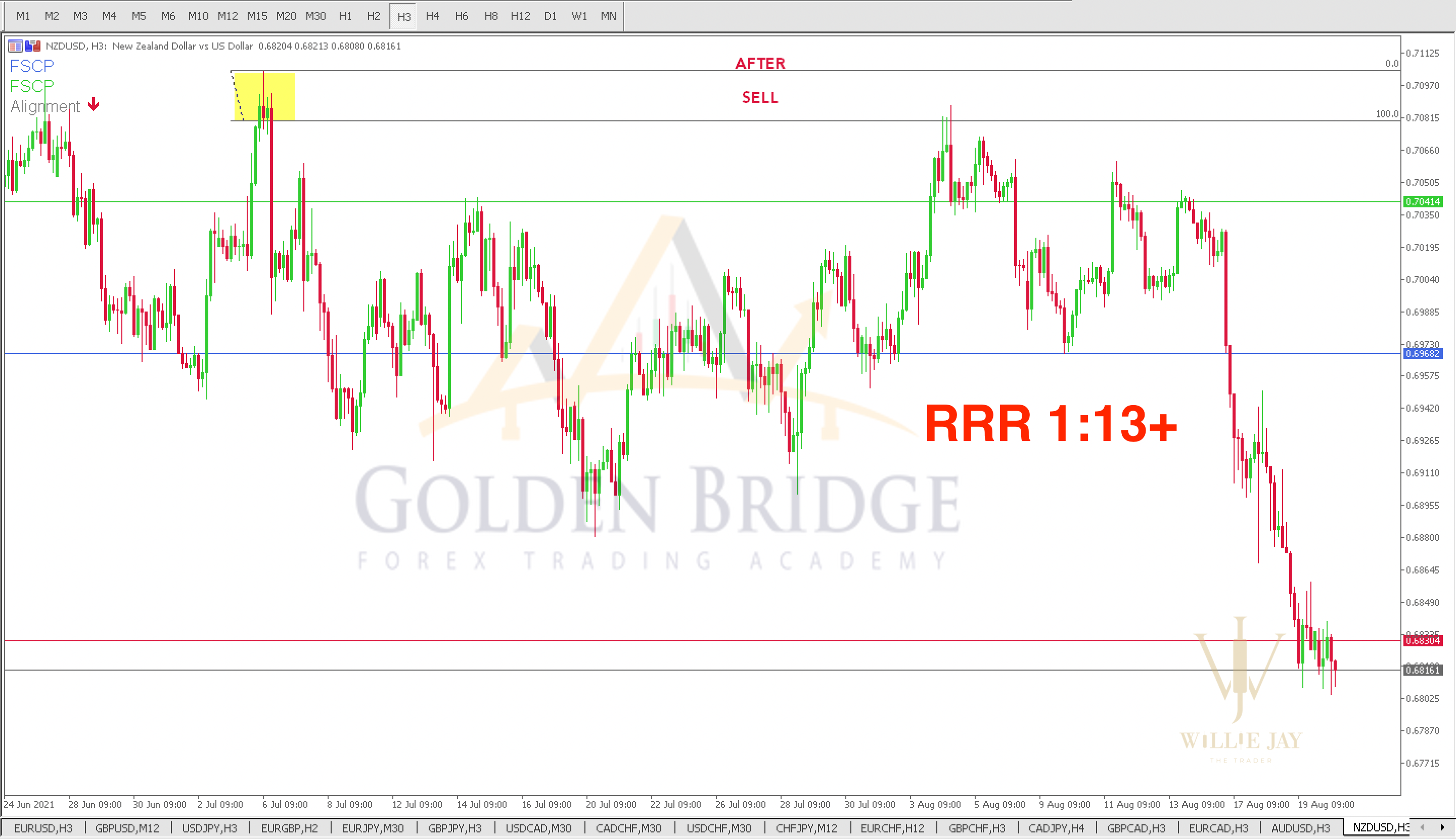
Price moved about 13× the risk (RRR 1:13+)
USDCHFM20 chart
BUY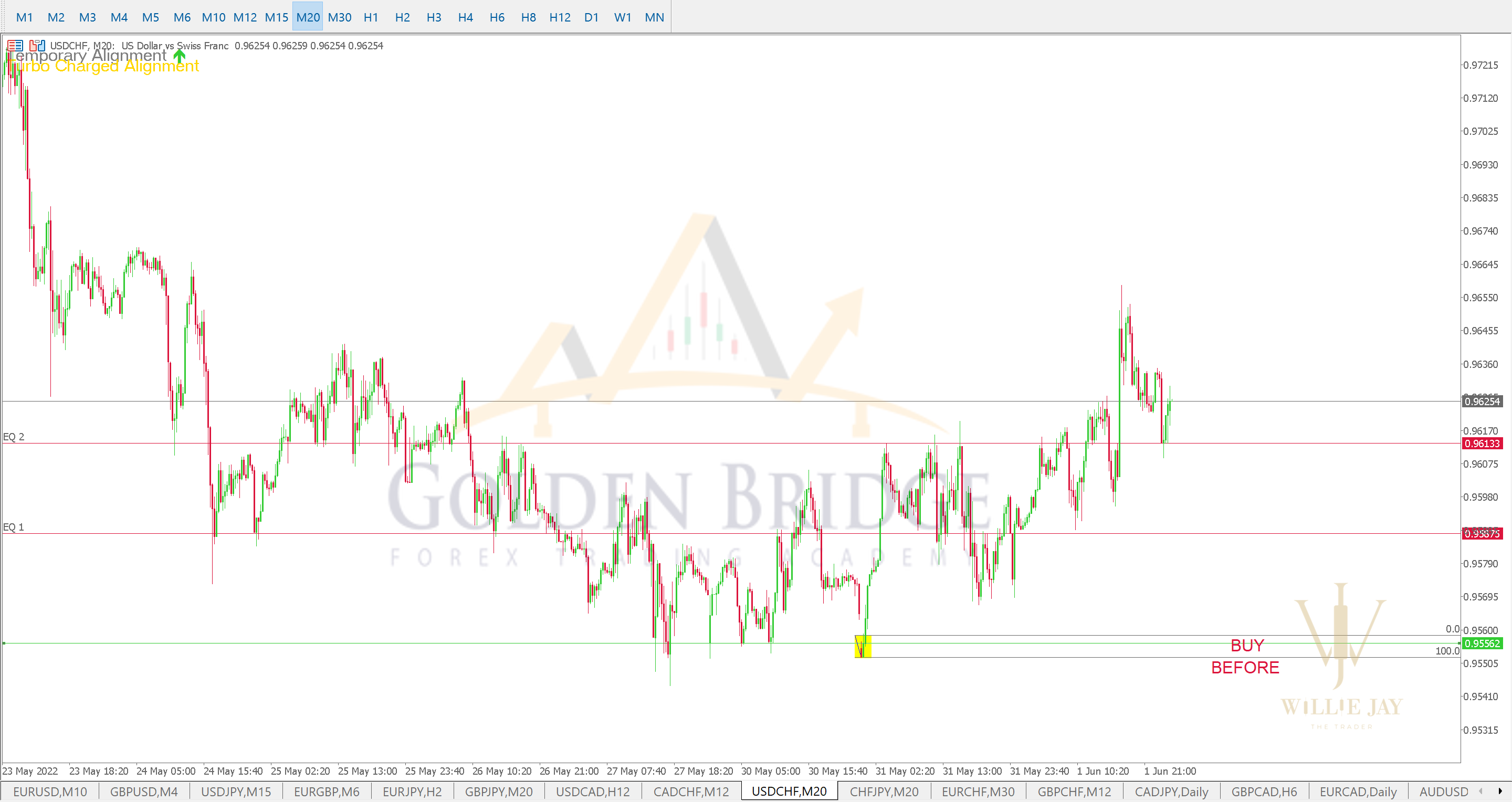
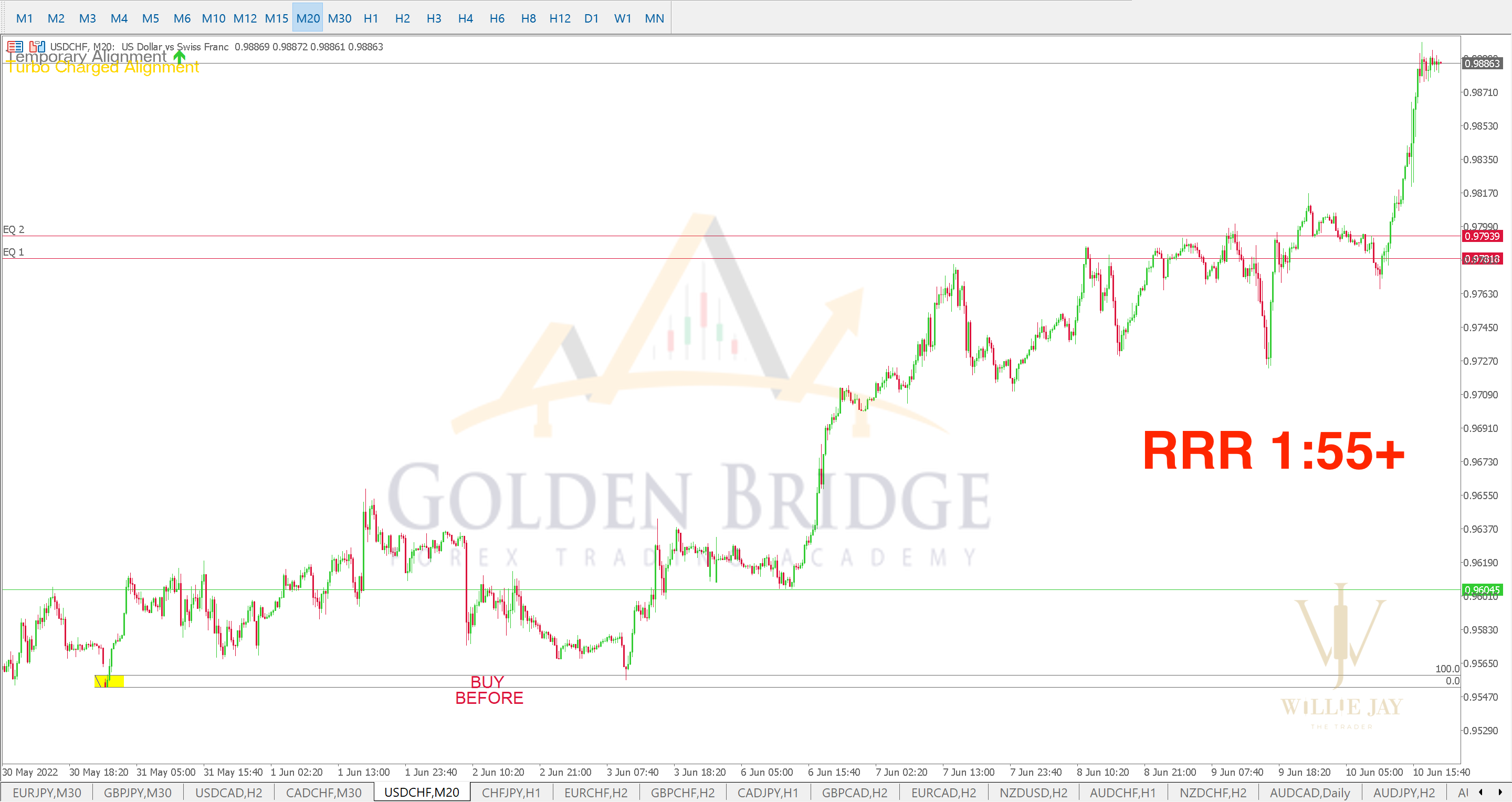
Price moved about 55× the risk (RRR 1:55+)
GBPCADH1 chart
SELL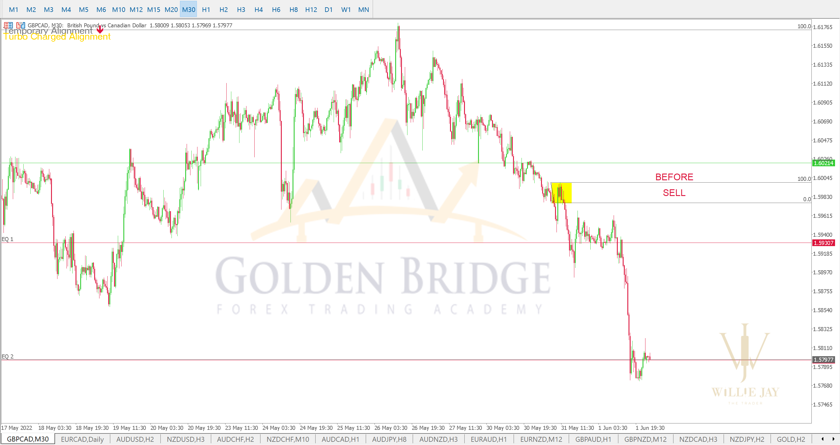
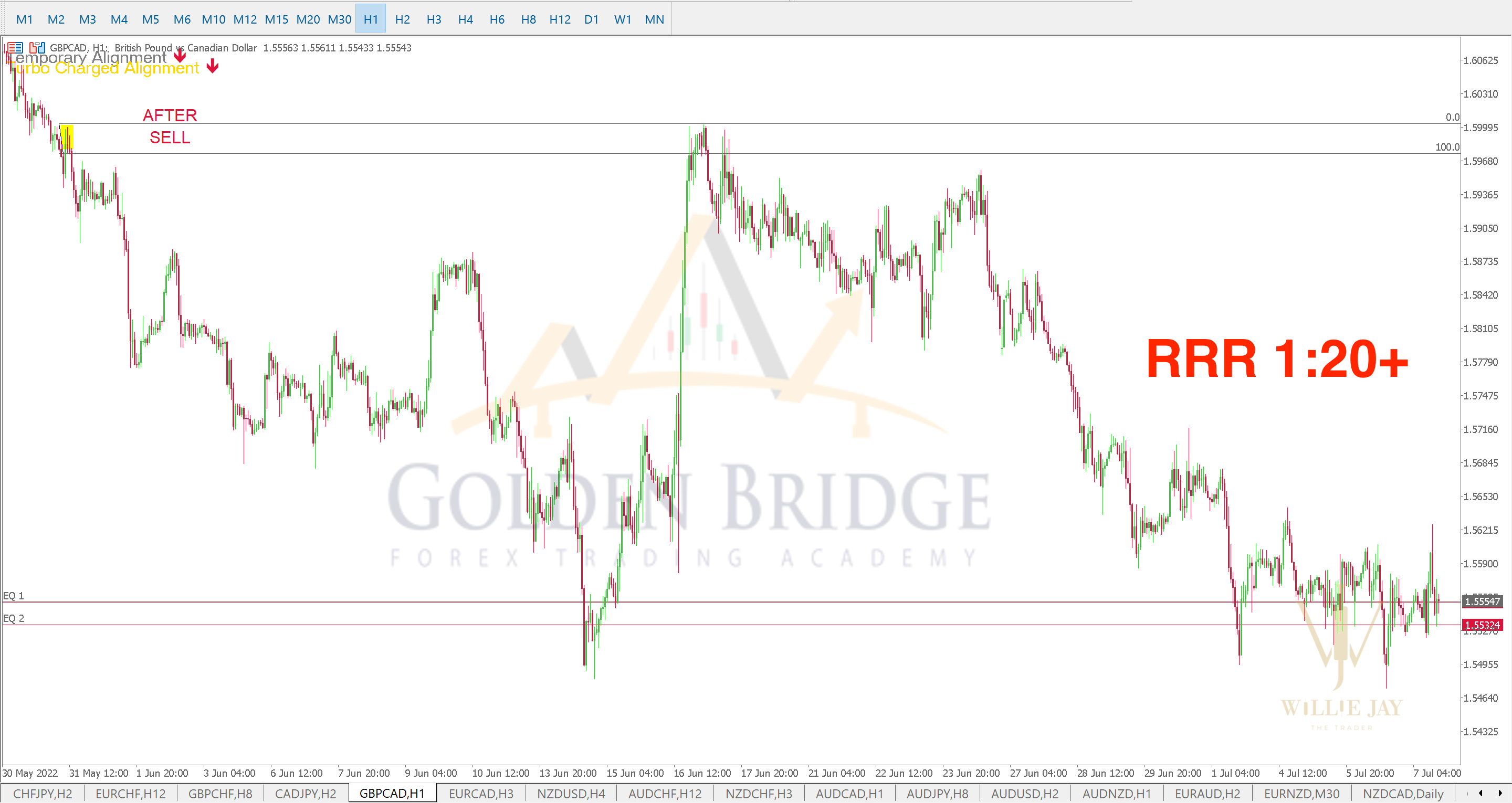
Price moved about 20× the risk (RRR 1:20+)
AUDCADM15 chart
SELL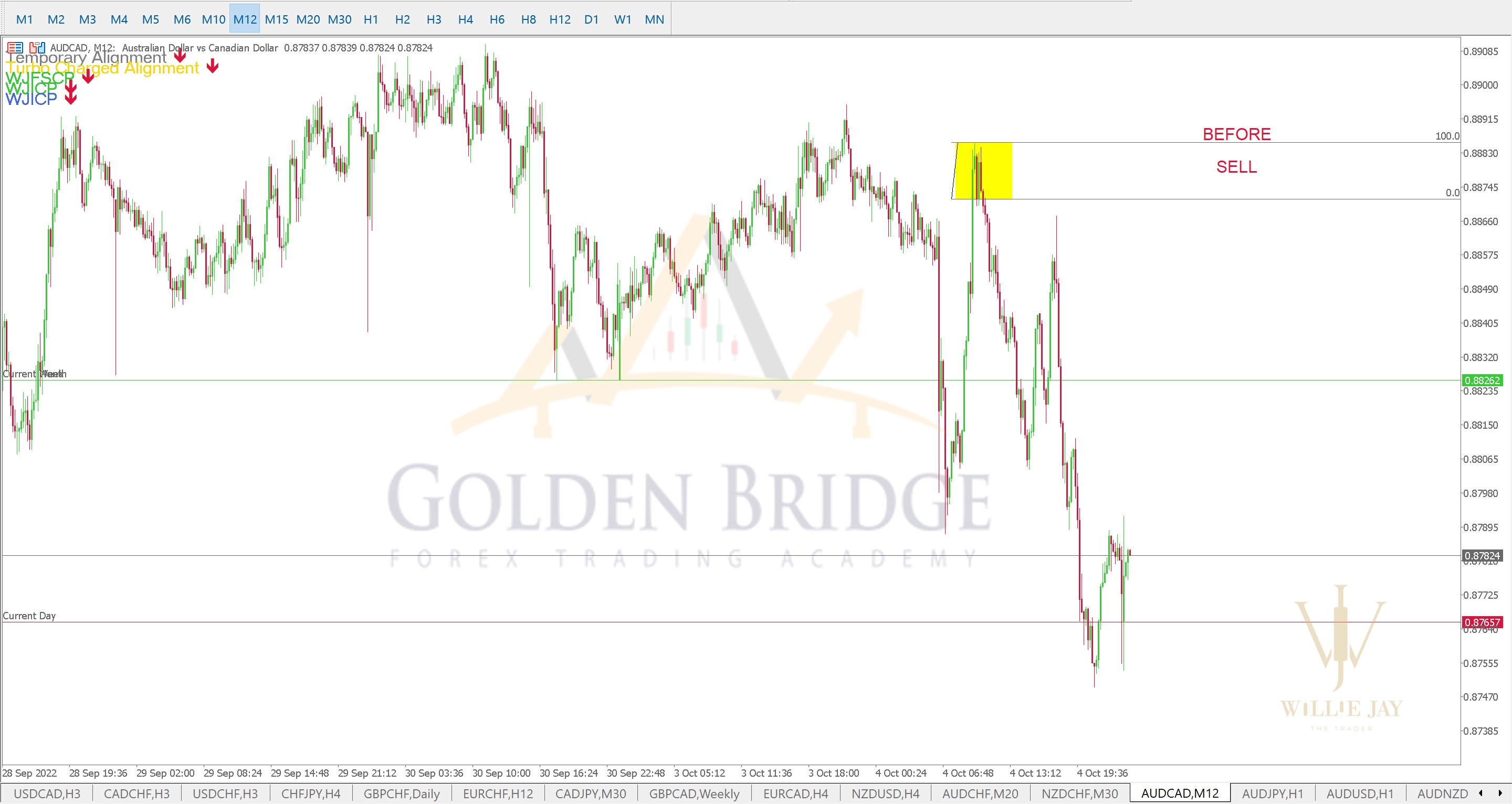
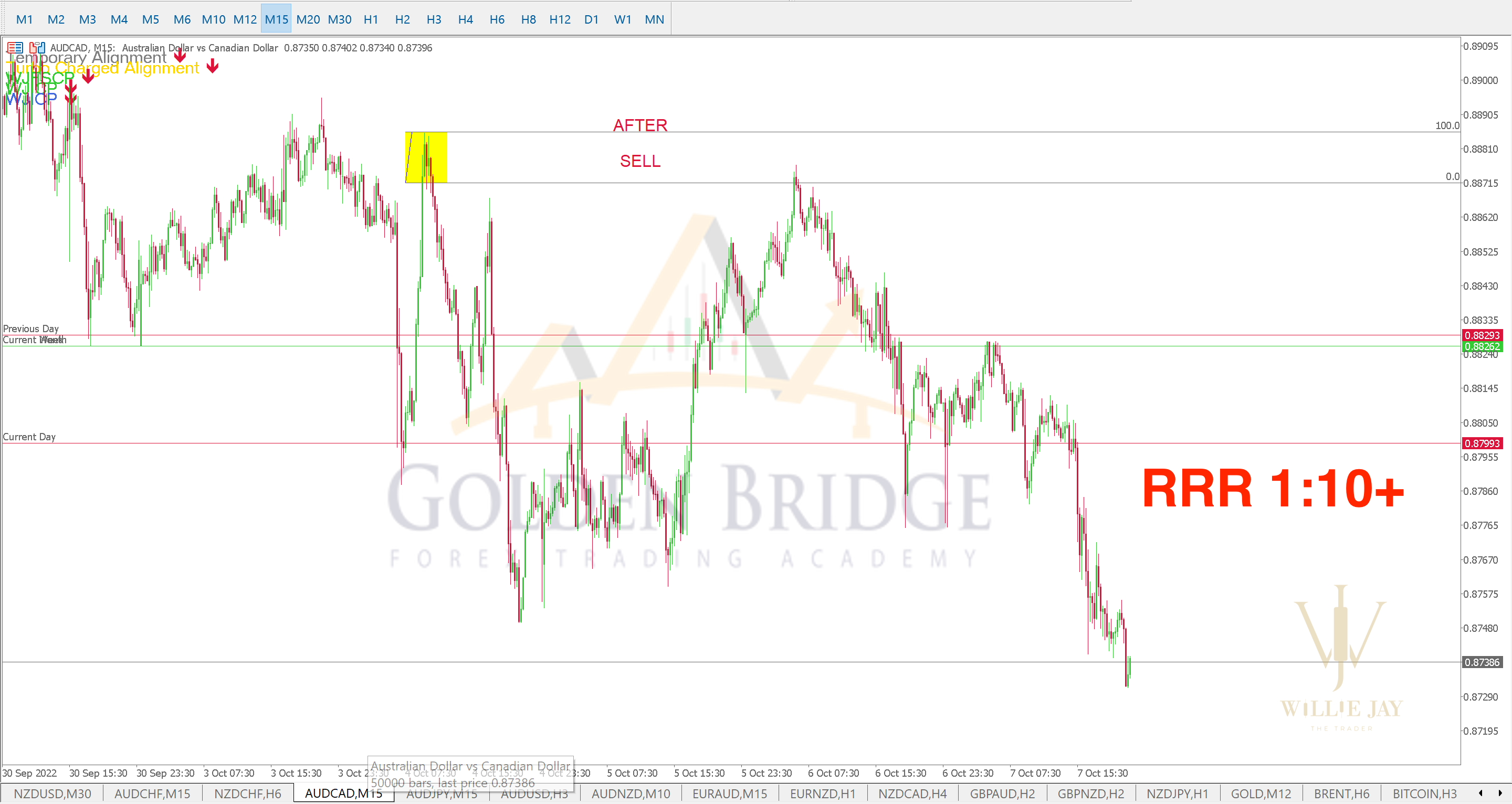
Price moved about 10× the risk (RRR 1:10+)
AUDCADH2 chart
SELL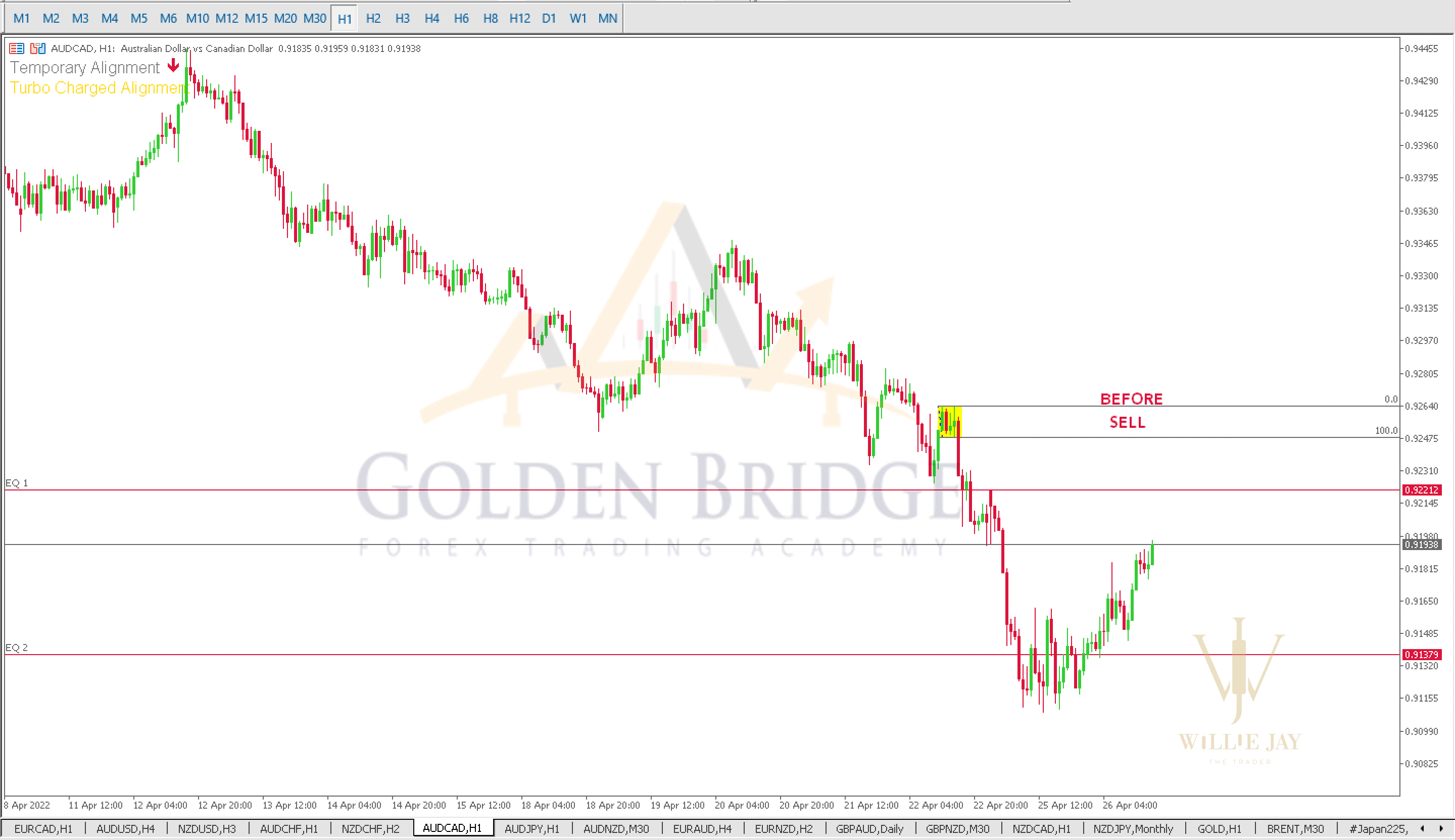
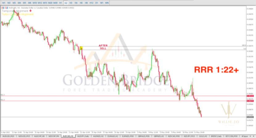
Price moved about 22× the risk (RRR 1:22+)
AUDJPYM20 chart
SELL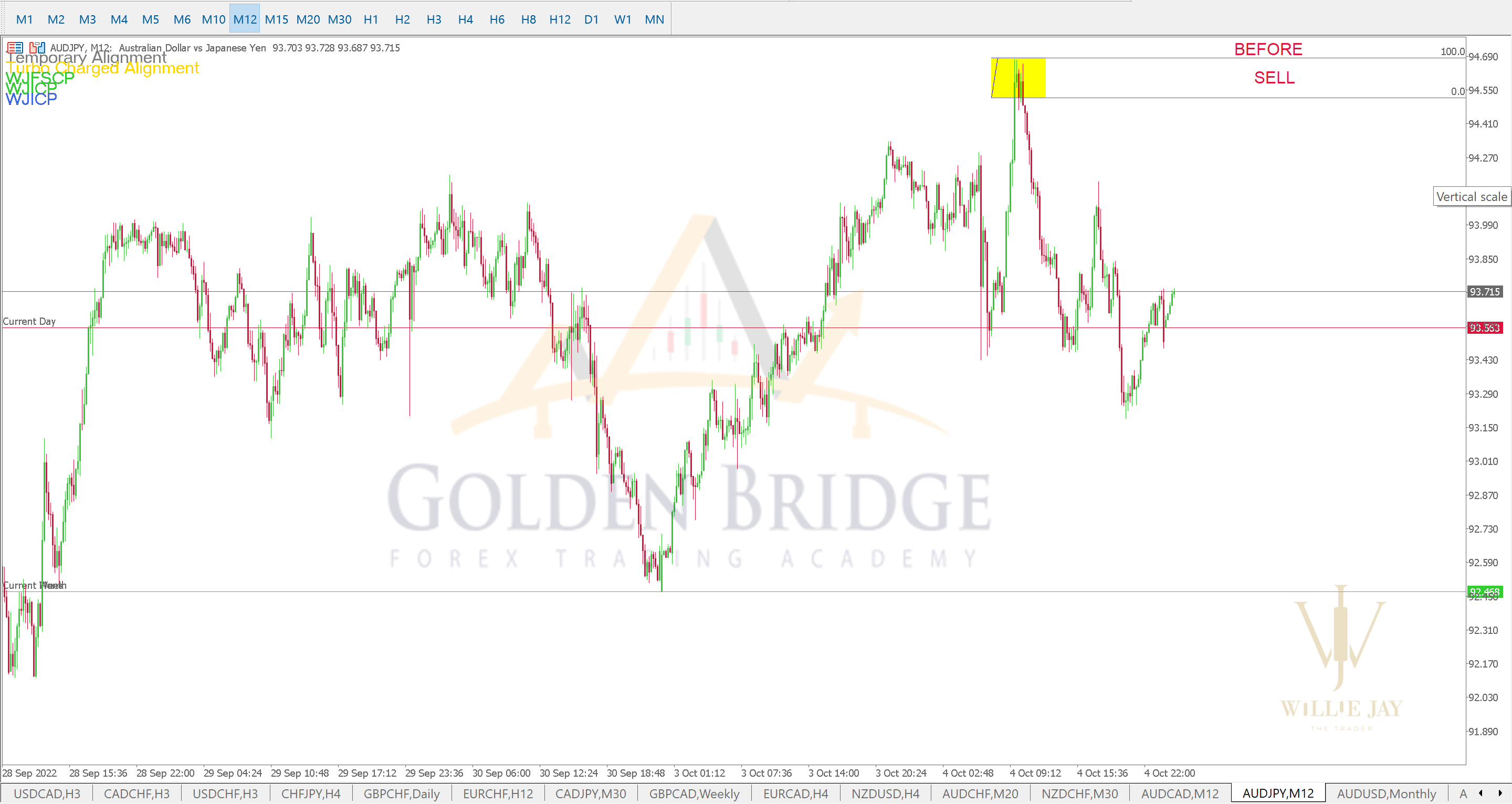
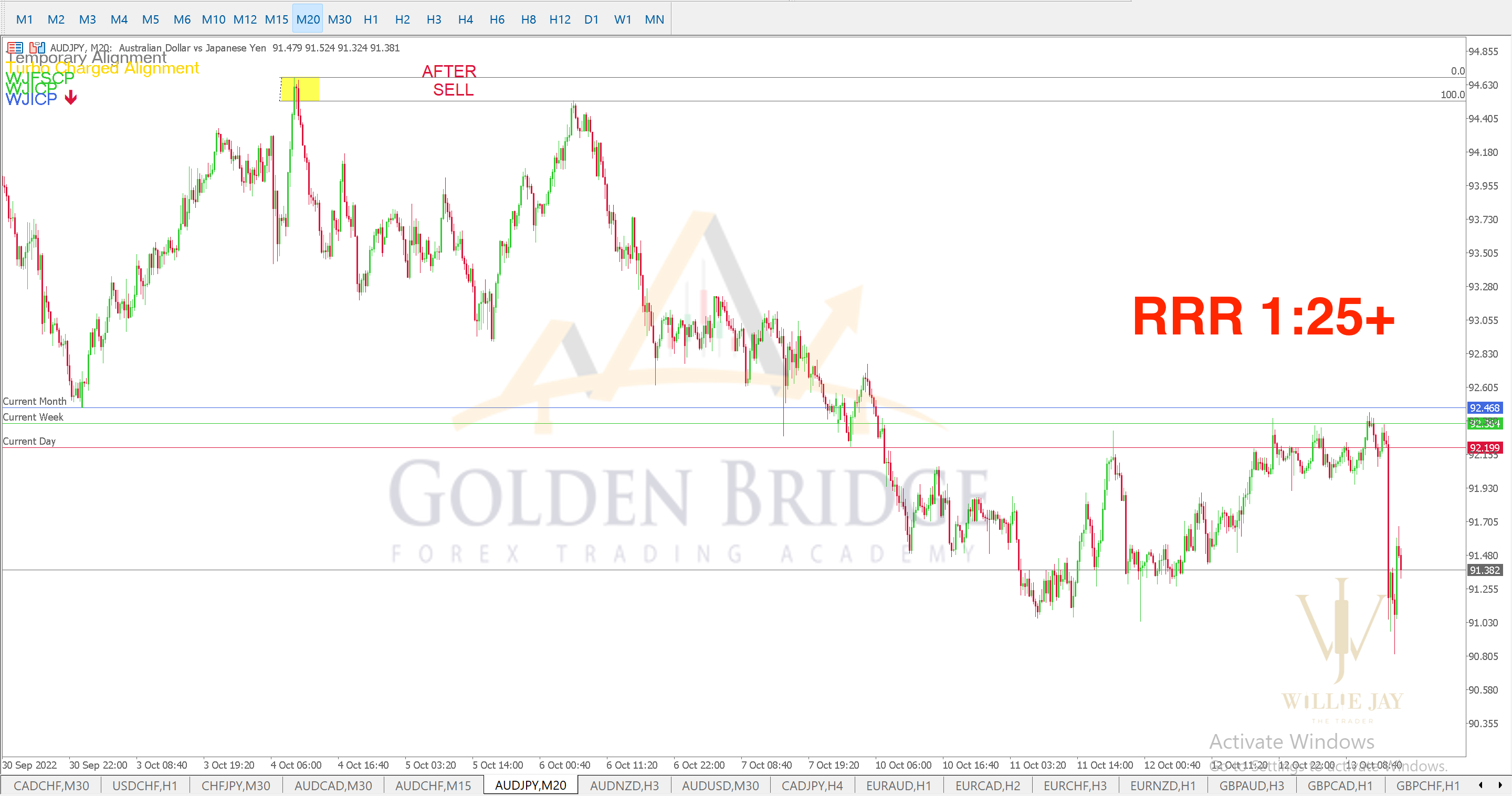
Price moved about 25× the risk (RRR 1:25+)
NZDCADM15 chart
BUY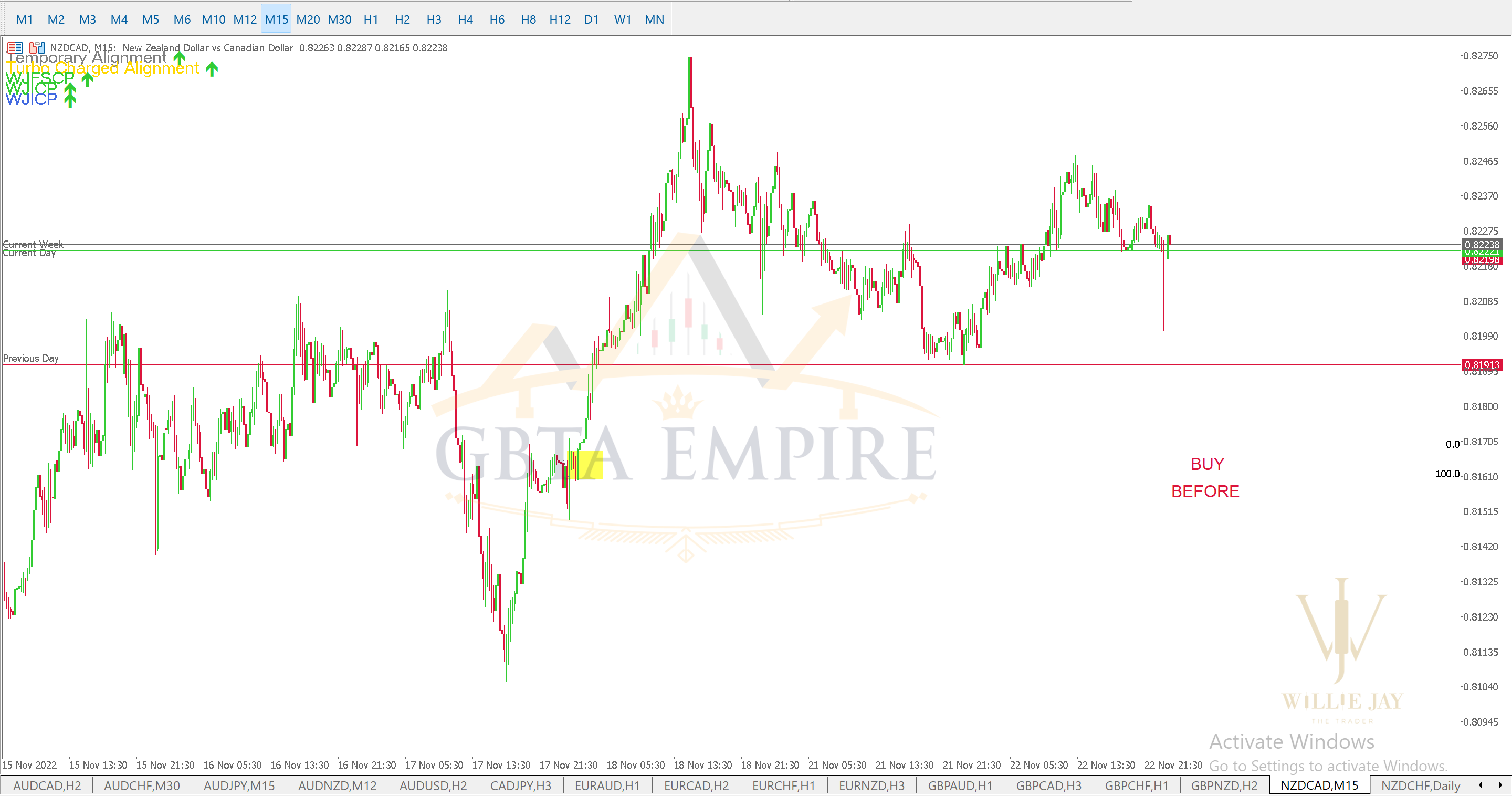
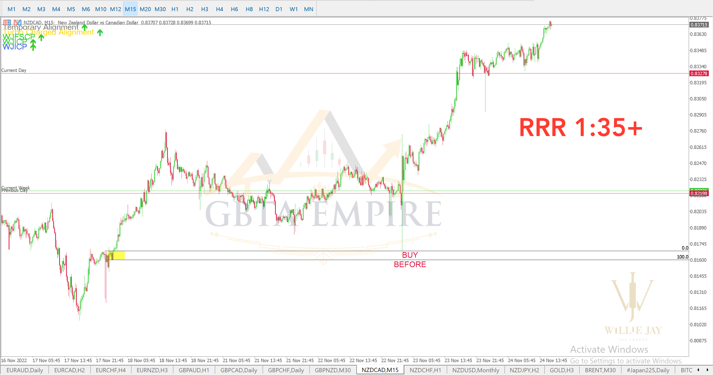
Price moved about 35× the risk (RRR 1:35+)
GBPCADH3 chart
SELL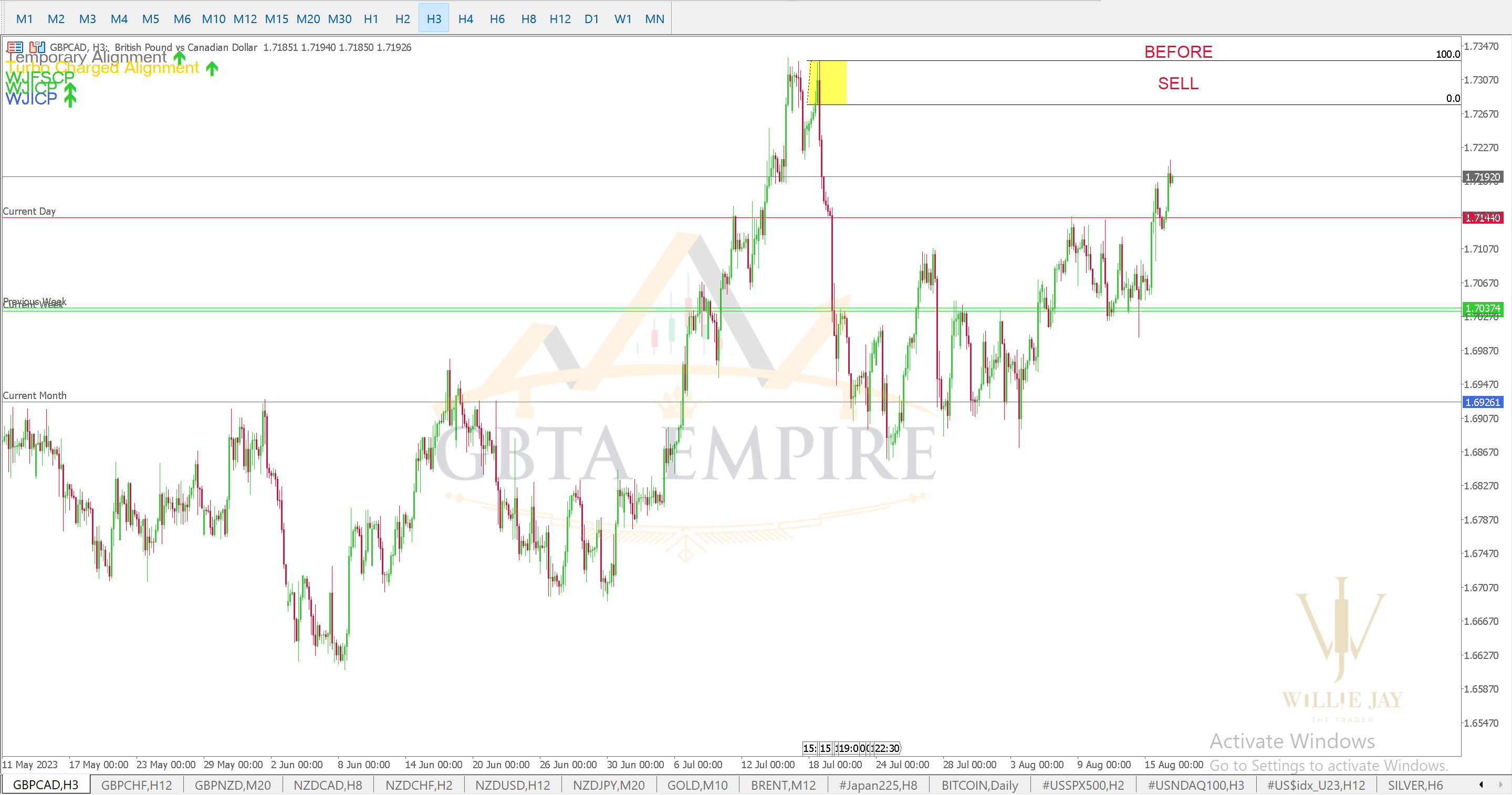
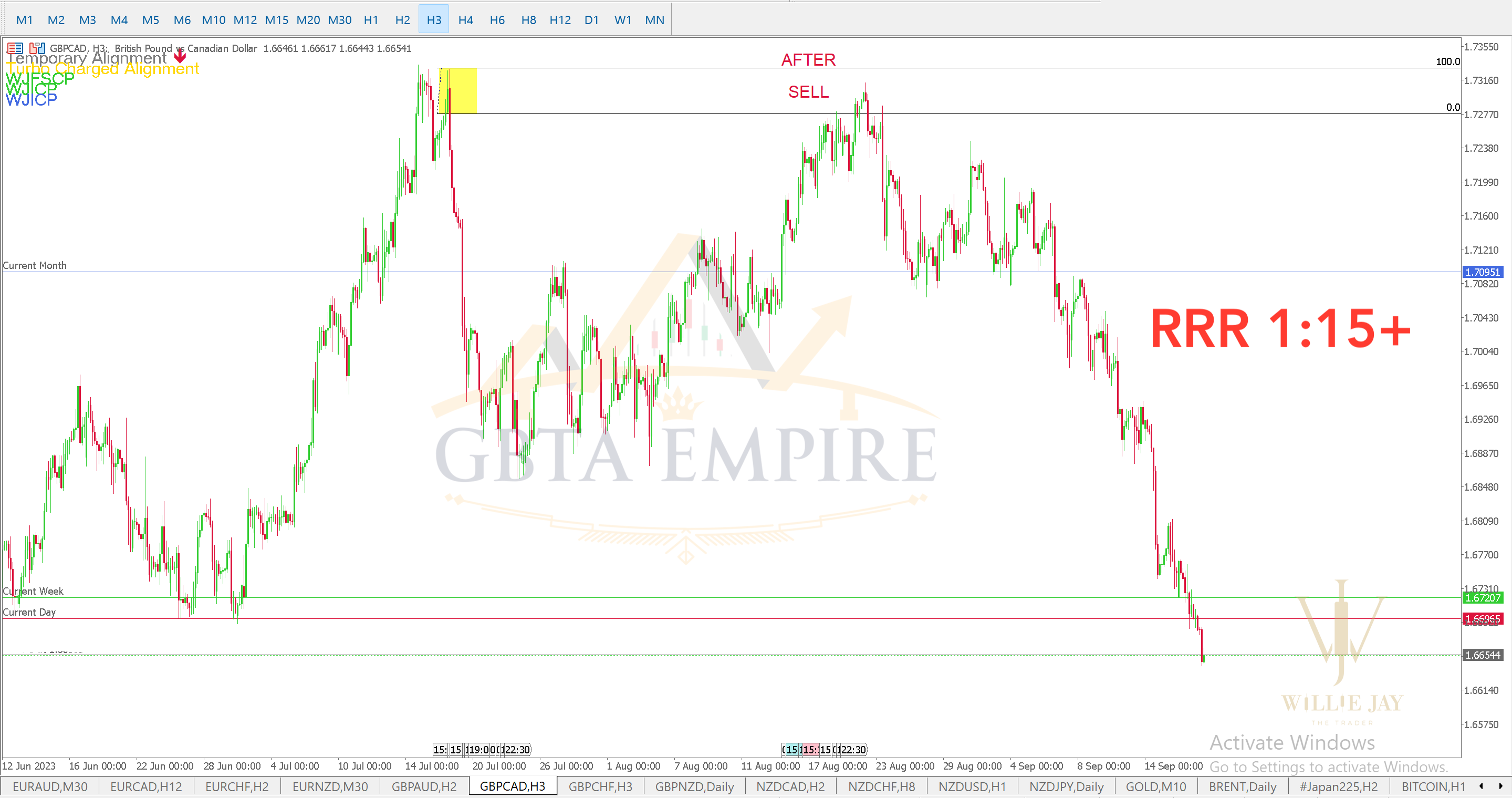
Price moved about 15× the risk (RRR 1:15+)
Read this first
These are selected teaching examples from 2019, chosen to show how the method reads the market. They are not a record of every trade and do not show account profits. Losing setups happen, and the size of a move after entry is not the same as the profit a trader keeps. Trading forex, indices and commodities involves risk, and results depend on each trader’s discipline. GBTA Empire provides trading education, not financial advice.Learn to Mark These Zones Yourself
Start with the free Starter course, then go deeper with Advanced and Mastery.